JB Information Security
Information Security through: employee education and awareness, security policy implementation and enforcement, offensive security measures and countermeasures
IT Security Resources
- ISO
- CIA
- Offensive Security
- Kali Linux OS
- DARPA
- WHOIS
- ICANN
- SANS
- OWASP
- Exploit Database
- US-CERT
- National Institute of Standards and Technologies
- National Vulnerabilties Database | SPNSR DHS
- Network Information Security and Technology News
- Mitre.org
- Defense Information Assurance Support Environment
- Defense Information Systems Agency
- SNORT
- NMAP.org
- Dark Web
- SQL Injection Prevention
- MetaSploit
- FBI CyberCrime
- TAILS Linux OS
- Electronic Frontier Foundation
- SecLists.org
- SecTools.org
- Insecure.org
- Honeynet Project
- Best Cyber Security Tools of 2016
- Center For Internet Security
- InfomationWeek Dark Reading
- Have I Been Pawned
- MYIP
- Christopher Battelli Katy Times Article
- Chris Battelli Murder Search
InfoGraphics
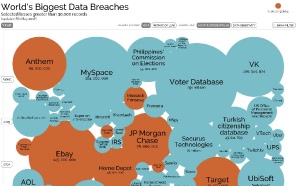
This infographic is the best "real-time" infographic that I've seen available about data breaches. The information it updated and kept current by the site owners and is available at Information Is Beautiful

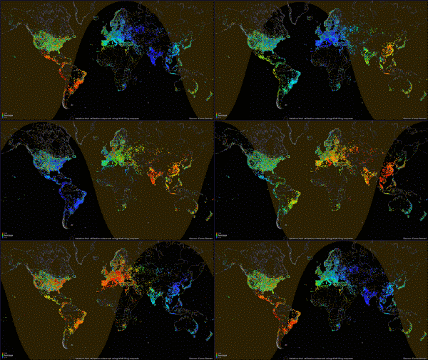
Map illustrating ipv4 requests based on the time of day. Notice use is higher (red) during the day.

